As an interior designer, paint color is one of the most powerful tools in my design toolkit. I've been working with Sherwin-Williams paints ever since design school, and I keep coming back to them for their quality, consistency, and always-on-trend color palette. If you're looking for timeless classics or bold showstoppers, this list has something for every room and style.
Ready to test a color in your own space? I highly recommend ordering real painted samples from Samplize.com—they make choosing so much easier. Now, let’s dive into my favorite shades!
These whites are my go-to choices for trim, cabinetry, or light and airy spaces.
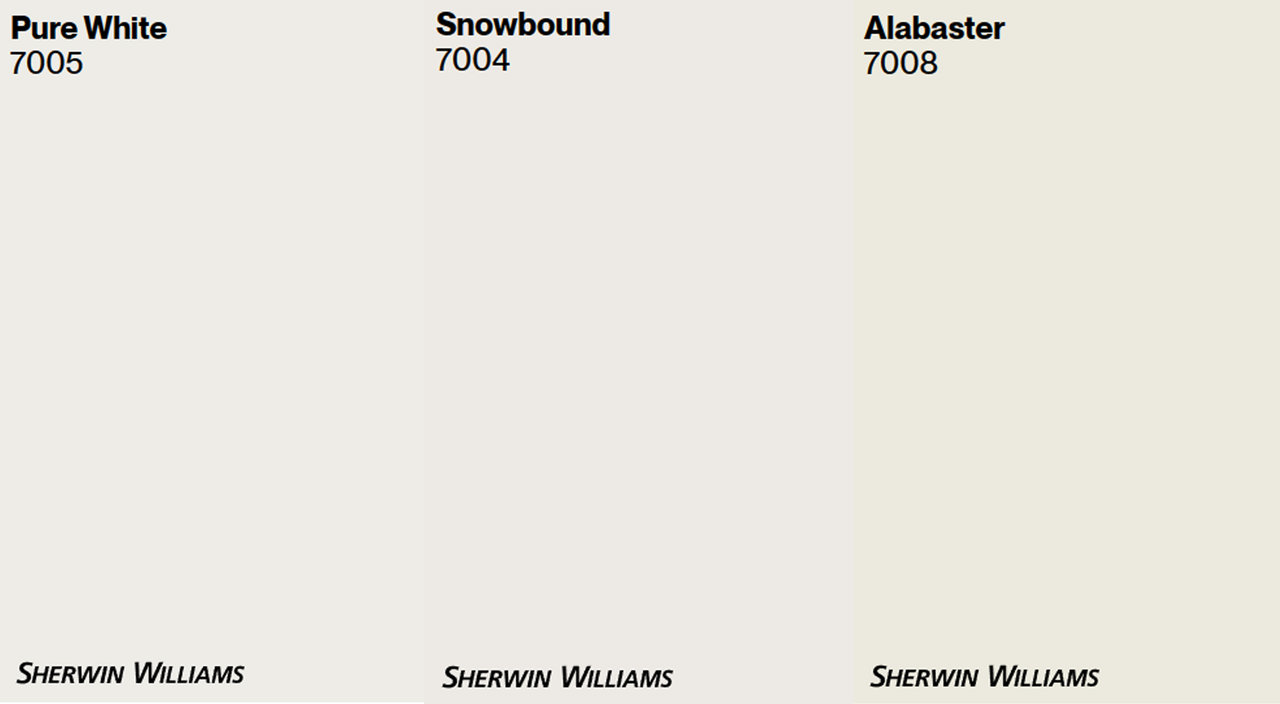
Crisp and clean, perfect for trim or built-ins, especially next to lighter wall colors.
A soft, slightly warm white that feels cozy but still fresh.
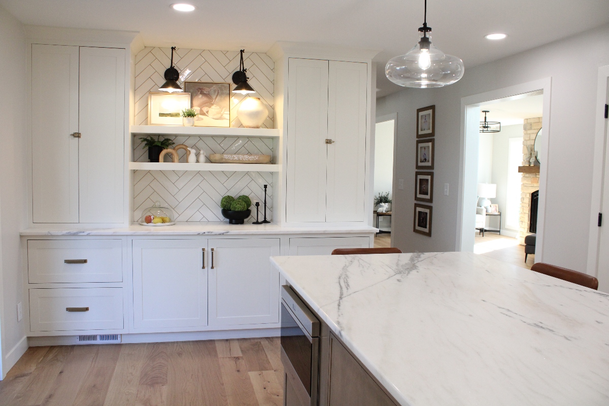
A creamy white that looks amazing on cabinetry or walls for a warm, welcoming glow. (Shown in the photo.)
If you're looking for a timeless whole-home neutral, these are always safe and stunning choices.
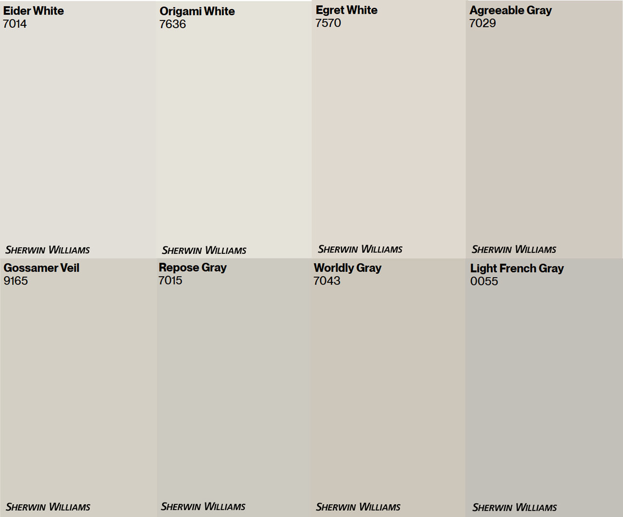
A balanced greige that works beautifully in living rooms, kitchens, hallways, and baths. Not too gray, not too tan.
An off-white that pairs well with wood tones and offers a subtle hint of color.
Check out more of my favorite neutrals in the palette on the right!
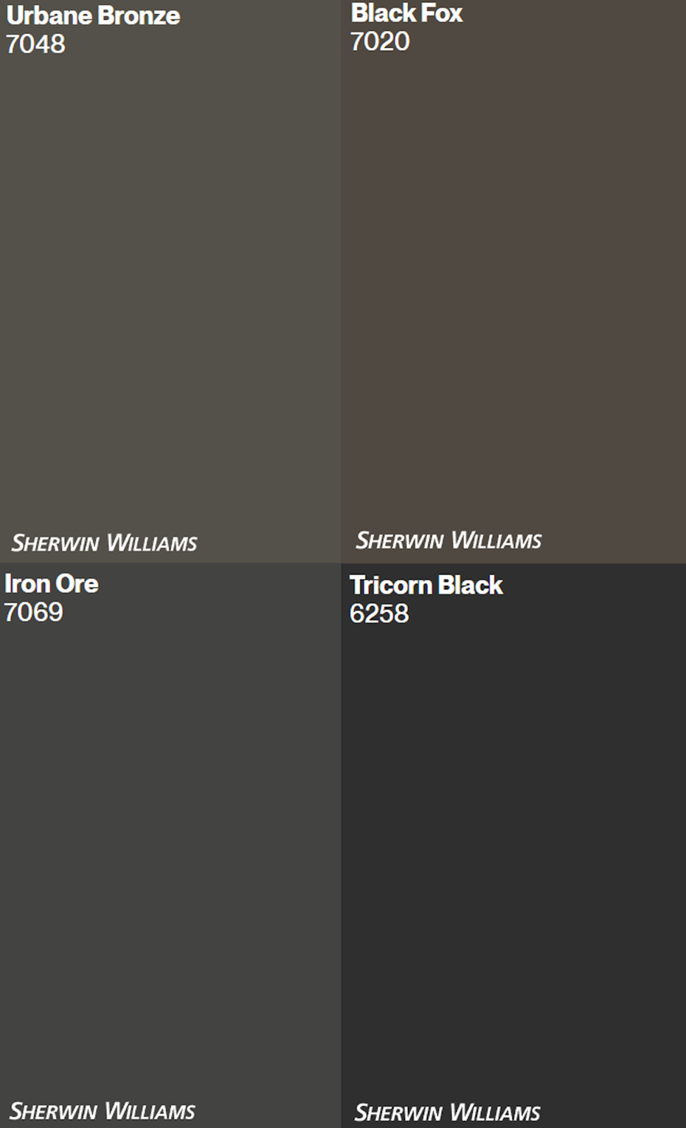
For those bold and moody vibes, these colors bring drama and depth in the best way.
A rich, black-brown that’s cozy and grounding.
Another stunning black-brown with warm undertones, perfect for a cozy office or bedroom.
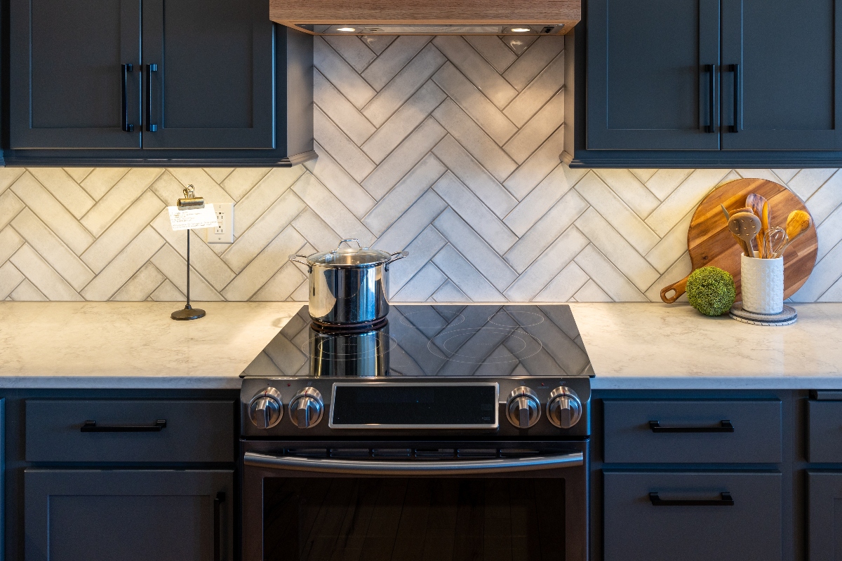
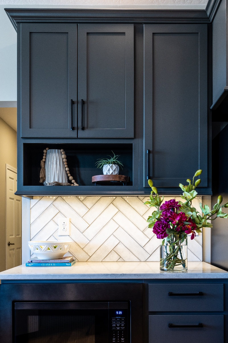
A soft charcoal-black that looks especially great on cabinetry. (Shown in the photo below.)
A true, deep black for maximum contrast and bold design.

Add personality and calm to your space with these soft yet impactful hues.
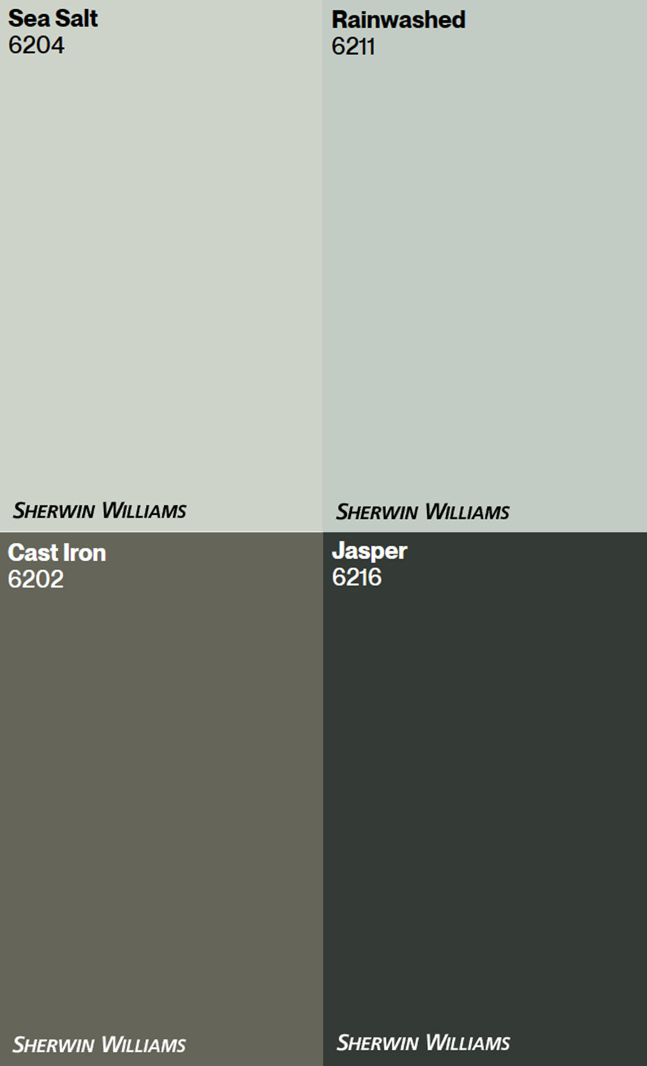
A serene greenish-blue that's gorgeous in bathrooms, laundry rooms, or kitchens.
A slightly bluer version of Sea Salt—tranquil and spa-like.
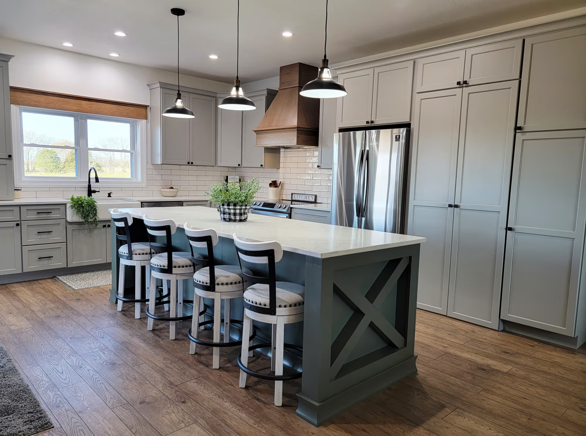
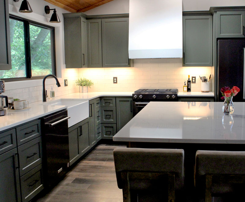
A muted green-gray that I’m using in my own kitchen for the base cabinets (and I’m obsessed). (Shown on cabinets in the photo below.)
A deep, moody emerald green that’s almost black. We paired it with a botanical wallpaper in our showroom, and it’s absolutely stunning!
👉 Click below to order peel-and-stick paint samples from Samplize and see these beautiful shades in real life before committing.
Let me know which colors you’re loving—or if you’ve used any of these in your own home! I’d love to hear how they worked for you.